EXPERiENCE CREATED
BRANDING, INTERIOR DESIGN, ENVIRONMENTAL DESIGN & MARKETING
UBC Okanagan Pritchard Dining Hall and Orchard Store
CLIENT
UBC OKANAGAN
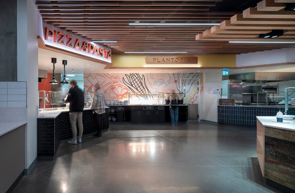
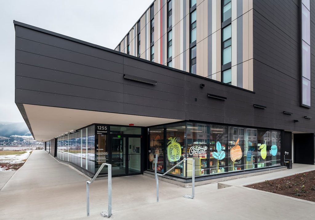
We were tasked with naming and developing a comprehensive interior design and branding package for the 500 seat student dining hall, and separate convenience store in the newly built Nechako Residence building. Taking a cue from the adjacent agricultural landscape and the namesake donor family history, the new Pritchard Dining Hall and Orchard Store uses natural materials and textures that reflect the uniqueness of the Okanagan.

Knowing that the student population is an equal blend of BC, national, international, our approach was to create spaces and branding which foster social interaction and warmth. Much was said, during the concept development workshop, about colour, texture and light, and all stakeholders agreed that these should reflect the Okanagan and contrast wood and natural materials with stronger pops of colour.
The Pritchard Dining Hall features a unique an all-you-care-to-eat dining experience. Guests are invited to select from a diversity of food options available at multiple stations throughout the servery, allowing them to customize their choices. The facility mainly services students from the Cassiar, Nicola, Purcell, Kalamalka, Valhalla, Skeena, Similkameen Place and Nechako residences.
The design team looked for ways to make the usual “cafeteria” transactional experience different. This challenge was met by developing a list of strategic objectives, collaborating with the UBCO project group, UBC Properties Trust and Teeple Architects.
The objectives were to:
1. Create a brand that connects with students and makes them feel welcome
2. Create a brand that reflects the physical and cultural environment in and around UBCO
3. Create an environment that offers opportunities for diverse experiences
4. Create an environment and experience that reflects the cultural mix within the student population
The design team enhanced the space visibility and legibility with several strategies to create more welcoming areas that are easier to navigate. The comprehensive interior design and branding strategy supports the gathering, networking, presentation, and interaction of students, staff, faculty, and neighbours.
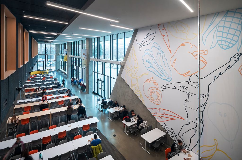
The foundation of the concept was driven by creating a local market experience. The concept of a local market is reflected in the use of materials, from woods and tiling to the patina and textured finishes. Similarly, the illustration style was designed to be loose, approachable and familiar, adding to the comfort and warmth of the servery, seating area and store. In balance, we provided a clean and modern look to the typography, with clearly presented information and demarcation.
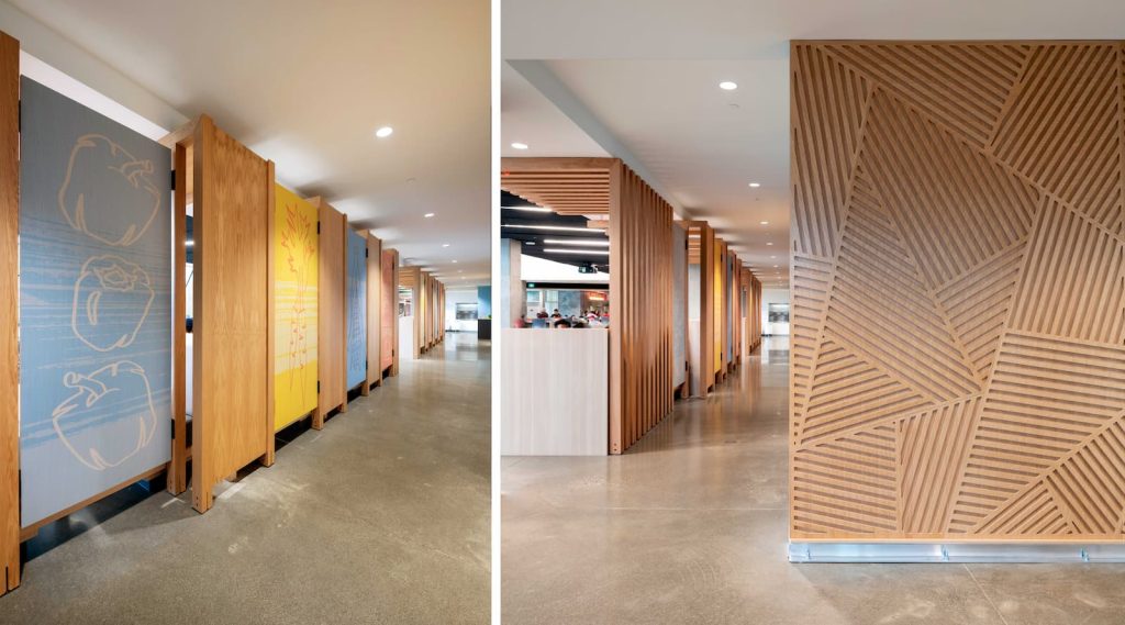
The front entrance wall to the dining hall reflects the geometric patterns seen in the agricultural landscape. The pattern is seen throughout the servery bulkheads, and a geometric pattern is used on the ceiling throughout the servery. The painting of the Pritchard logo and the finish of the individual letters within the servery are hand crafted, creating a unique and organic quality that aligns with the natural environment and the people that farm, harvest and cook with local foods.

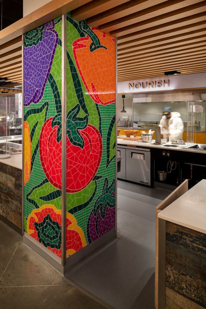
Because one third of the student population consists of international students, where English may be a second language, the design team decided to add an illustrative element to the brand to communicate food options. One example is the center island within the servery that offers a diverse salad bar. Because of its prominence within the space, a colourful and modern mosaic was created to demarcate the area. Throughout the servery and the Orchard Store, illustration is used as a compelling branding device, bringing personality and dynamic qualities, with enriching colours, textures, and natural materials to bring a vernacular marketplace experience.
