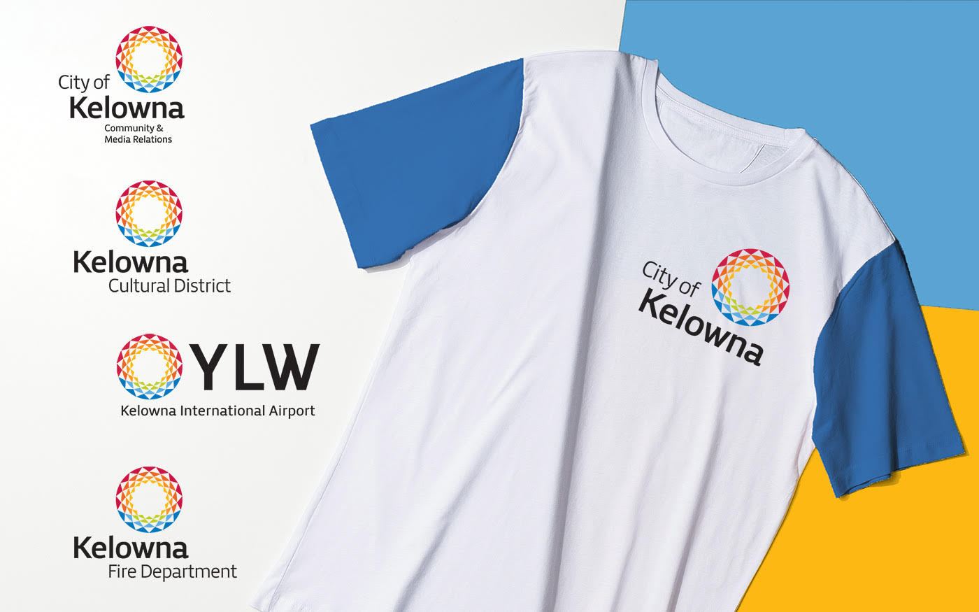
The City wanted a new identity that conveyed its more cosmopolitan aspects while representing its roots as an attractive, family-oriented community. The City had a disjointed community presence with 13 different logos representing separate programs or departments. There was also a lack of uniformity in the use of the cities’ main identity. Marketing materials were being produced by multiple parties both within the city and by outside suppliers without the direction of any logo brand guidelines.
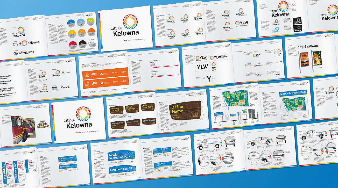
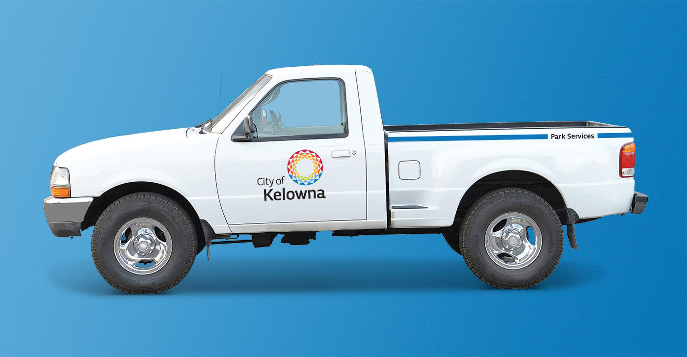
With the launch of the new City identity, a new signage strategy for all City owned vehicles, buildings and sites was also required. A detailed audit was done of all the city’s signage requirements including permanent and temporary signage, partner sponsorship signage, buildings, working sites, and vehicles.
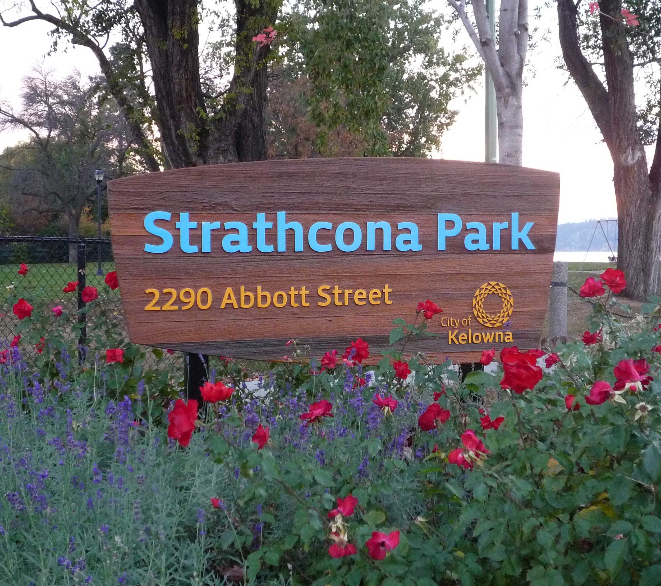
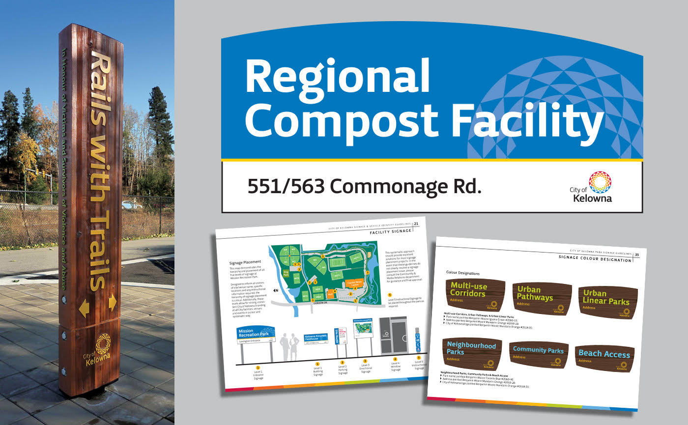
A second signage plan was required for community parks, linear parks, and beach access parks.
Both signage strategies include size options, layouts, font pallet, colour pallet, materials, custom icons, vehicles, project signage and mounting specifications. Included are vertical and horizontal design options to meet the requirements of each site.
The final identity was inspired by the Interior Salish hand woven baskets, the Ponderosa pine cone, the Arrow leaf Balsamroot (Kelowna’s official flower) and the area’s geography.
The airport also required a separate identity and marketing tag line. We created the line “Your Link to the World” based on the airport code letters – YLW.